gatsby-plugin-md-menus
What is this?
This is a Gatsby plugin that generates hierarchical menus from Markdown (.md) files . It automatically creates a menu based on the directory structure and filenames of your content directory in your gatsby site.
How to Use It
Installation
You can install the gatsby-plugin-md-menus via npm or yarn:
Using npm
npm install gatsby-plugin-md-menusUsing yarn
yarn add gatsby-plugin-md-menus##Configuration
After installing the plugin, you need to add it to your gatsby-config.js file. The plugin requires a configuration object to work properly.
module.exports = {
  plugins: [
    {
      resolve: 'gatsby-plugin-md-menus',
      options: {
        config: {
          sidebar: {
            forcedNavOrder: [
              '/introduction', // Order of menu items
              '/key-concepts',
            ],
            collapsedNav: [
              '/introduction', // Menu items to collapse
              '/key-concepts',
            ],
          },
          //This is optional
          gatsby:{
            pathPrefix: "/", // default is '/'
            trailingSlash: false // Default is false
          }
        }
      }
    }
    // other plugins
  ]
};
Configuration Object
The configuration object defines how your menu items should be structured and displayed. Here’s an example configuration:
const config = {
  sidebar: {
    forcedNavOrder: [
      '/introduction', // Order of menu items
      '/key-concepts',
    ],
    collapsedNav: [
      '/introduction', // Menu items to collapse
      '/key-concepts',
    ],
  },
  //This is optional
  gatsby:{
    pathPrefix: "/", // default is '/'
    trailingSlash: false // Default is false
  }
};
Folder Structure
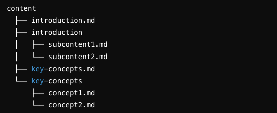
For the plugin to work correctly, your content folder should have Markdown files and corresponding directories that match the parent Markdown files. Here is an example structure:

-
introduction folder
-
Contains subcontent related to
introduction.md. -
key-concepts folder
-
Contains subcontent related to
key-concepts.md.
Usage
Once the configuration is in place and your content is organized, the plugin will automatically generate the hierarchical menu based on the specified order and collapsed items.
Using the Menu Component
To render the menu in your Gatsby site, you can import and use the Menu component provided by the plugin in your React components. Here’s an example of how to do this:
import React, { useState } from 'react';
import Sidemenu from 'gatsby-plugin-md-menus/sidemenu';

const Sidebar = ({setMenu}) => {

  return (
    <Sidemenu onClickMenuItem={setMenu} />
  );
};

export default Sidebar;
Theme Configuration
This configuration allows you to customize the appearance of the side navigation menu and the left sidebar.
The configuration file can be found at:
ROOT_DIRECTORY/src/components/theme/index.js
section: {
  navActiveCol: '#001933', // The text color of an active side menu item.
  navChildCol: 'white',    // The text color of an inactive side menu item.
},

leftSideBar: {
  catTitle: '#004C48',     // The text color of the category title.
  menuHover: '#004C48',    // The background color of a side menu item when hovered.
  menuActive: '#09A4A7',   // The background color of the active side menu item.
  iconNormal: 'white',     // The color of the icons in the side menu.
  iconHover: '#7CC9CD',    // The color of the icons in the side menu when hovered.
}
Contributing
We welcome contributions! Please feel free to submit issues, fork the repository, and make pull requests
License
This project is licensed under the MIT License - see the LICENSE file for details.