


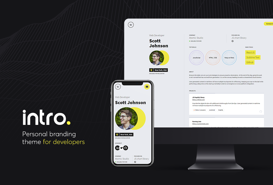
Intro (academic variant) - Personal branding theme for academics
Intro is an open source Gatsby theme built specially for developers.
This is a variant adapted for academics.
Preview (original theme)
Live Demo
Live demo is available at: https://weeby.studio/intro/preview
Features
- Highlight your current research topics, tools, publications, projects & career path
- 10 predefined color versions
- YAML files as a data source
- Contact form integrated with Formspree
- Uses utility-first TailwindCSS framework
- Responsive design (desktop / mobile)
🚀 Getting Started
Install theme & dependencies
mkdir my-site
cd my-site
yarn init -2
yarn add gatsby react react-dom @arene/gatsby-theme-intro-academic
Enable theme
Then add the theme to your gatsby-config.js.
module.exports = {
  plugins: [
    {
      resolve: "@arene/gatsby-theme-intro-academic",
      options: {
        theme: "classic",
        darktheme: "dark-blue"
      },
    },
  ],
}
Copy the contents of the demo site
(Normally the gatsby-theme-intro-academic theme would automatically create the content directory on the first run, but a bug currently causes it to do so with the contents for the base theme, rather than this -academic variant.)
Copy the folder site/contents from https://github.com/alcrene/gatsby-theme-intro-academic.git into your site, so that the directory structure now looks like this:
my-site
└── content
   ├── images
   │   ├── profile.jpg
   │   └── project.jpg
   ├── academic-history.yaml
   ├── papers.yaml
   ├── profile.yaml
   ├── projects.yaml
   └── social.yaml
Run your site
That’s it, you can now run your site using
gatsby develop(If run on an empty site, this process will create content/ directory within your site with a sample data. However currently this uses the samples from the base theme.)
Edit content
You can change the website’s content by editing .yaml files in content/ directory:
profile.yaml
Follow existing convention to provide your profile information, skills & tools.
Do not remove existing parameters from the file, as it may break the website.
| Parameter | Value | Is required? |
|---|---|---|
| name | yes | |
| initials | yes | |
| profession | yes | |
| location | yes | |
| institution | yes | |
| research_focus | yes | |
| focus_url | Adds a clickable icon below the research field | no |
| for_hire | Bool: true will display “Looking for a position” |
yes |
| relocation | Bool: true will display “Available for relocation” |
yes |
| topics | List of research topics that interest you | no |
| tools | List of tools/method you are experienced with | no |
| about | no |
TODO: Make topics clickable by assigning per-topic URLs
papers.yaml
| Parameter | Value | Is required? |
|---|---|---|
| authors | List of authors | yes |
| title | Publication title | yes |
| journal | yes | |
| date | (unrestricted format) | yes |
| doi | no | |
| url | URL for the official publication | no |
| URI for a downloadable PDF | no |
TODO:
- Support
doi,urlandpdf(currently ignored) - Allow organizing publications by year
projects.yaml
Currently the tab identifies these as “Software projects”.
For each project you can provide:
| Parameter | Value | Is required? |
|---|---|---|
| name | Name of the project | yes |
| url | URL of the project | no |
| description | Project’s description | no |
| status | Either in progress or live |
no |
| tags | List of tags | no |
| icon | Either github or website |
no |
| image | Path to the image | no |
TODO:
- Allow to differentiate projects, perhaps based on a “kind” field ?
academic-history.yaml
This replaces work-history.yaml from the base theme.
For each entry you can provide:
| Parameter | Value | Is required? |
|---|---|---|
| group | Name of the research group | yes |
| group_url | Research group’s website | no |
| department | no | |
| institution | no | |
| institution_url | no | |
| period | Start / End date | no |
| position | Your position at the company | no |
teaching.yaml
The teaching tab has a similar layout to projects.
For each entry you can provide:
| Parameter | Value | Is required? |
|---|---|---|
| name | yes | |
| url | no | |
| description | no | |
| date | no | |
| kind | One of class, tutorial or write-up |
no |
| image | no |
social.yaml
List of your social media accounts. Each social link shows up as an icon, but only when the url is specified.
With respect to the base theme, this variant adds support for
- ORCID
- Google Scholar
- ResearchGate
- Loop
It is not possible to add custom items to the list.
Formspree integration
At this time, this template removes the contact form from the base template, since contact forms are atypical in academia.
Configuration
Here is the list of configuration options you can set in gatsby-config.js:
module.exports = {
  siteMetadata: {
    description: "Personal page of John Doe",
    title: "John Doe",
    formspreeEndpoint: "https://formspree.io/f/{your-id}",
  },
  plugins: [
    {
      resolve: "@arene/gatsby-theme-intro",
      options: {
        basePath: "/",
        contentPath: "content/",
        showThemeLogo: true,
        theme: "classic",
        darktheme: "dark-blue",
        lang: null,
        tailwindConfig: null
      },
    },
  ],
}
After modyfying gatsby-config.js it may be required to restart gatsby develop process.
- The
siteMetadatasection is responsible for SEO settings. - By modifying
basePathparameter you can run the website on different URL (e.g.https://mydomain.com/profile). It may be useful when integrating with existing Gatsby site. - By setting
showThemeLogotofalseyou can hide the Intro logo in the footer area. - If provided, the value of
langis added to the<body>element. - Change the
themeparameter to load different color variant. Please refer to the list below for available values. darkthemeis an alternative theme, defined in the same way astheme. It is activited using Tailwind CSS’s dark mode machinery.- If provided,
tailwindConfigshould be an object. Any field it provides will completely overwrite the correspond field ingatsy-theme-intro’s default Tailwind configuration.
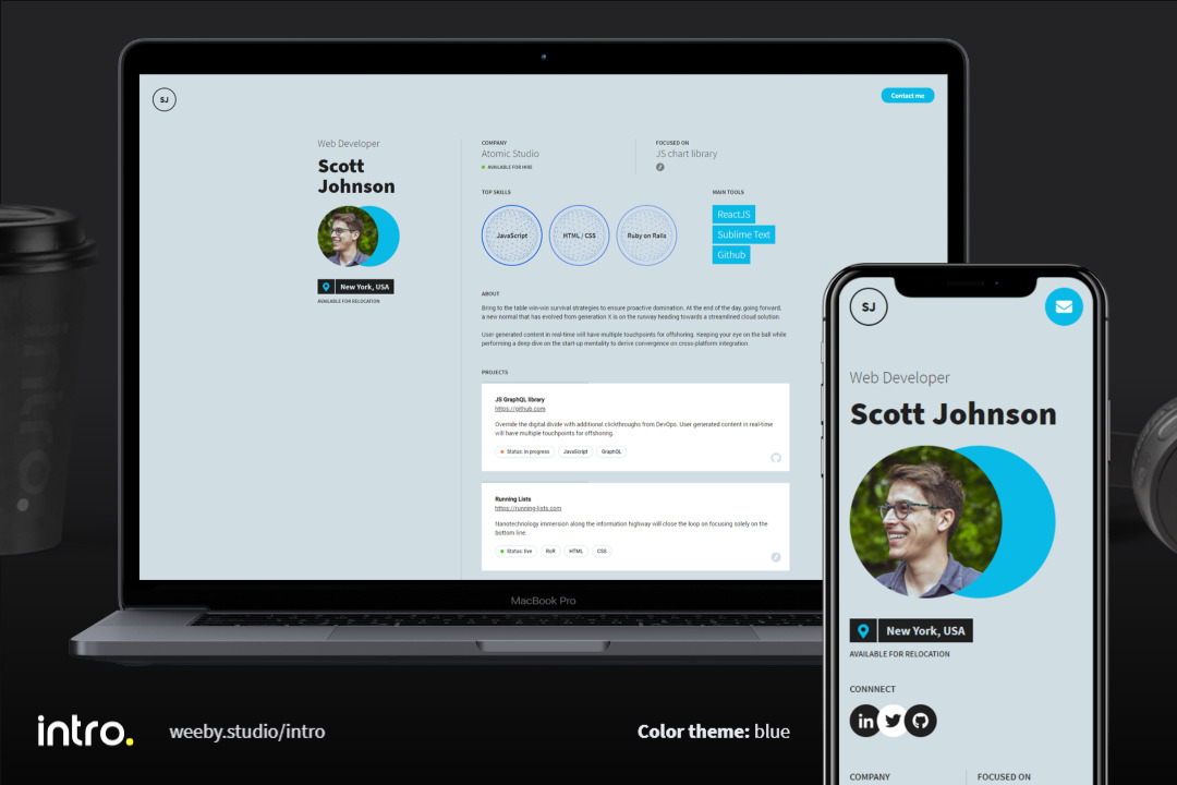
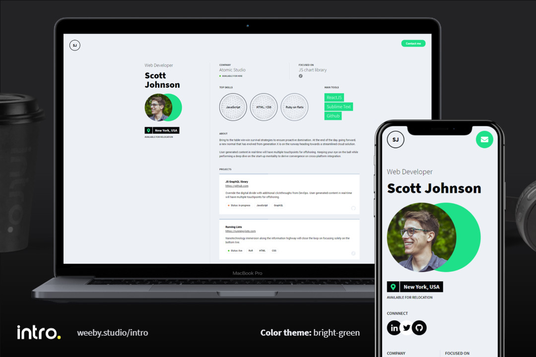
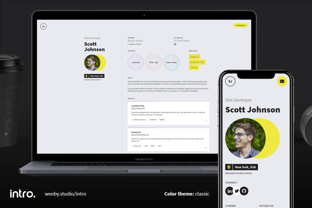
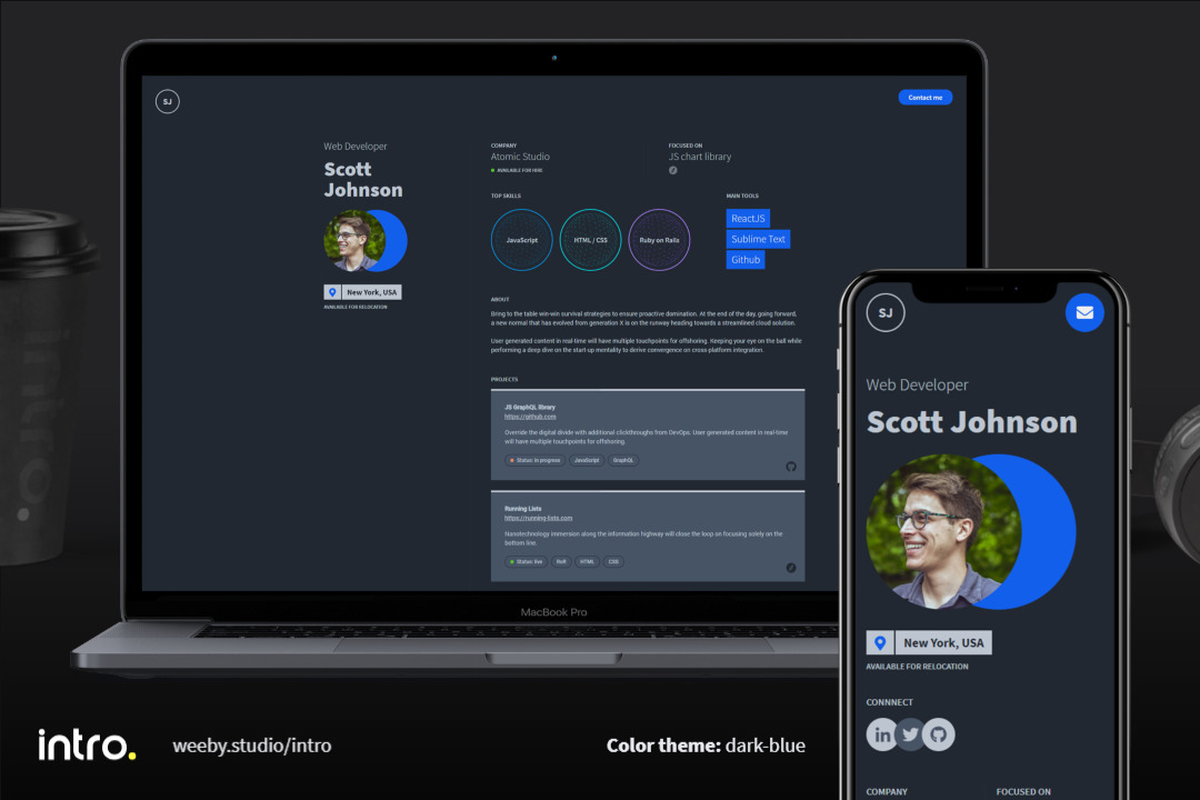
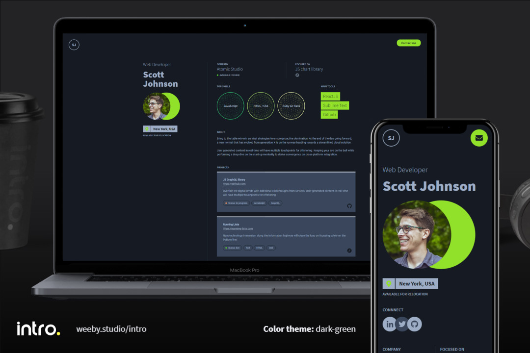
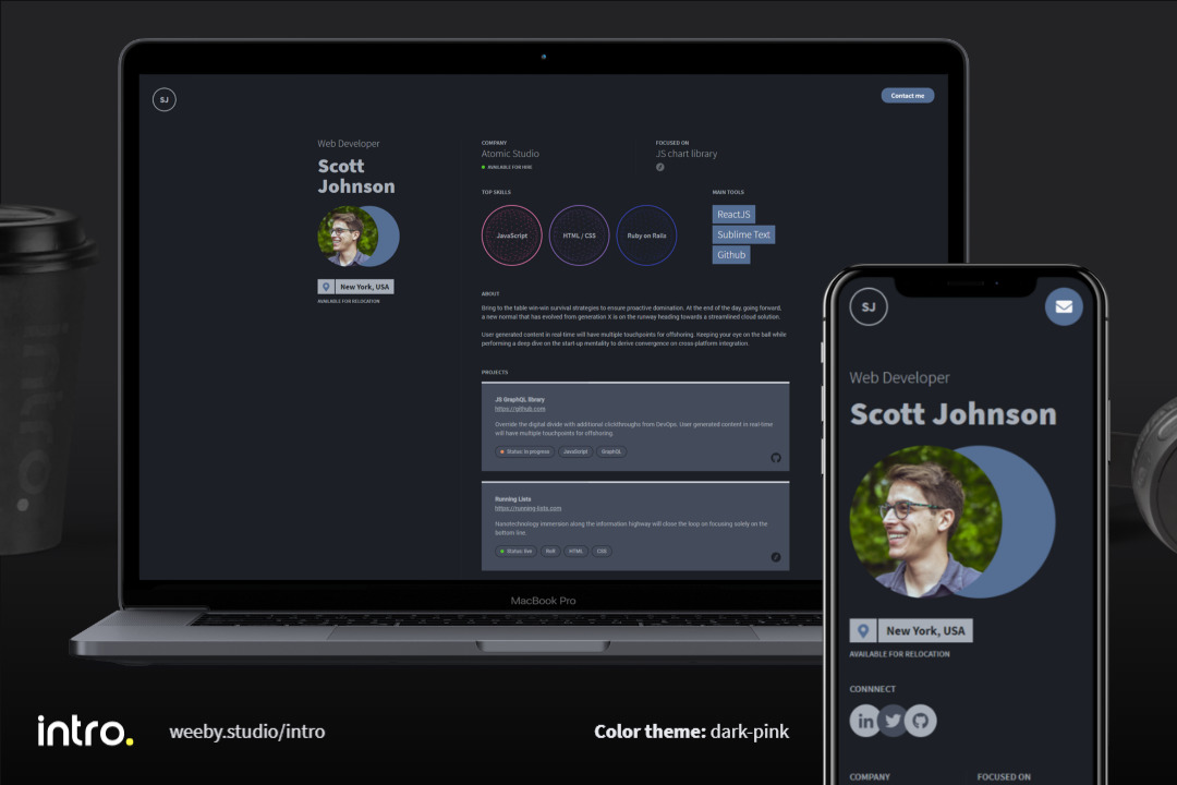
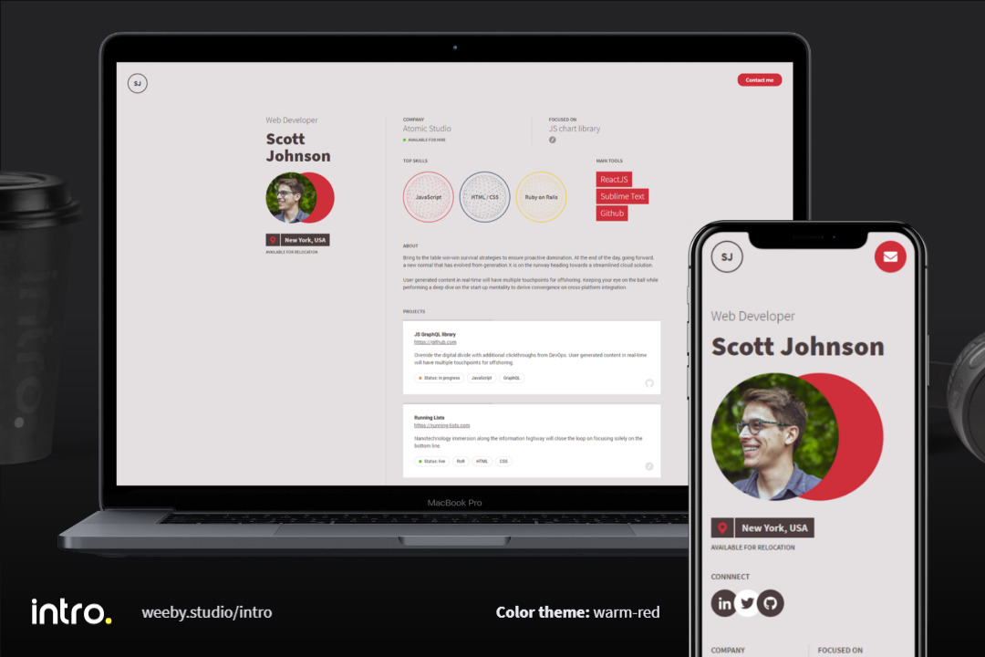
Available color variants
| Name | Preview |
|---|---|
blue |
click here |
bright-green |
click here |
bright-orange |
click here |
bright-red |
click here |
classic (default) |
click here |
dark-blue |
click here |
dark-green |
click here |
dark-pink |
click here |
gh-inspired |
click here |
warm-red |
click here |
Dark mode
This theme supports specifying a dark variant via TailwindCSS, using its "class" mode and a toggle button.
TODO: Add a third “OS preference” mode to the toggle.
Customization
Custom color variant
As theme parameter in theme configuration (gatsby-config.js) you can pass either the name of the existing theme or an object of colors.
Example:
module.exports = {
  (...)
  plugins: [
    {
      resolve: "@arene/gatsby-theme-intro",
      options: {
        (...)
        theme: {
          'back': '#edf0f3',
          'front': '#2b3137',
          'lead': '#2781ed',
          'lead-text': '#ffffff',
          'line': '#ced9e3',
          'skill-1': '#405060',
          'skill-2': '#fc8732',
          'skill-3': '#2ebc50',
        },
      },
    },
  ],
  (...)
}
Please remember, that after modyfying gatsby-config.js file it may be required to restart gatsby develop process.
Component shadowing
You can use Gatsby’s component shadowing mechanism to customize the theme. Since this requires knowing the original theme’s source layout, you will also want to clone the theme’s sources and possibly place them in a yarn workspace.
My recommendation is to clone my website project, which is already set up for this, following the instructions for a development installation and then those for updating content.
Updating dependencies
- Running
yarn upgrade-interactivewill check for any out-of-data packages, and propose to update them. It automatically updates the version ranges inpackage.jsonfiles.
Changelog
1.0.0
Initial version. Compared to gatsby-theme-intro:
- Heading changes
- Use of tabs
- Addition of “Publications” tab
- Addition of “Teaching” tab
About
Intro. is a theme created by Wojciech Kocjan from Weeby Studio.
This Academic variant was created by Alexandre René for personal use.
Thank you for using it!